
Boosting Demo Request & Organic Reach for AIFISE Website
Problem
AIFISE, an AI automation platform, was struggling to convert website visitors into qualified leads. The demo request form—a critical gateway for sales—was being overlooked. We were getting only 1–2 demo requests every 3–4 months.
Additionally, the site suffered from poor organic visibility, with negligible engagement from search engines.
Goal
Increase demo request conversions
Improve organic discoverability
Reduce bounce rate and increase session duration
Discovery & Research
Funnel Analysis
Using Google Analytics and Hotjar, I mapped the user journey:
Identified drop-off points before users reached the demo request section.
Observed friction points around navigation, CTA clarity, and visual hierarchy.
User Behavior Insights
Heatmaps revealed users were scrolling past key CTAs without interacting.
Session recordings exposed confusion navigating between product info and demo form.
Analytics showed high bounce rates, especially on landing pages, and low time on page.
Hypothesis Building
I formed the hypothesis:
“If we reduce cognitive load, increase CTA visibility, and guide users with a more intuitive layout and messaging hierarchy, more visitors will complete the demo request form.”
A/B Testing Strategy
We ran A/B and multivariate tests on:
CTA language: "Book a Demo" vs "Get a Personalized Demo"
CTA placement: Above-the-fold vs anchored post-scroll
Form length: Full form vs progressive disclosure (step-by-step)
Hero section messaging: Generic vs value-specific hook
These tests helped validate what worked in real time with live user behavior.
Design & UX Improvements
This was the most transformative part of the project.
Key Enhancements:
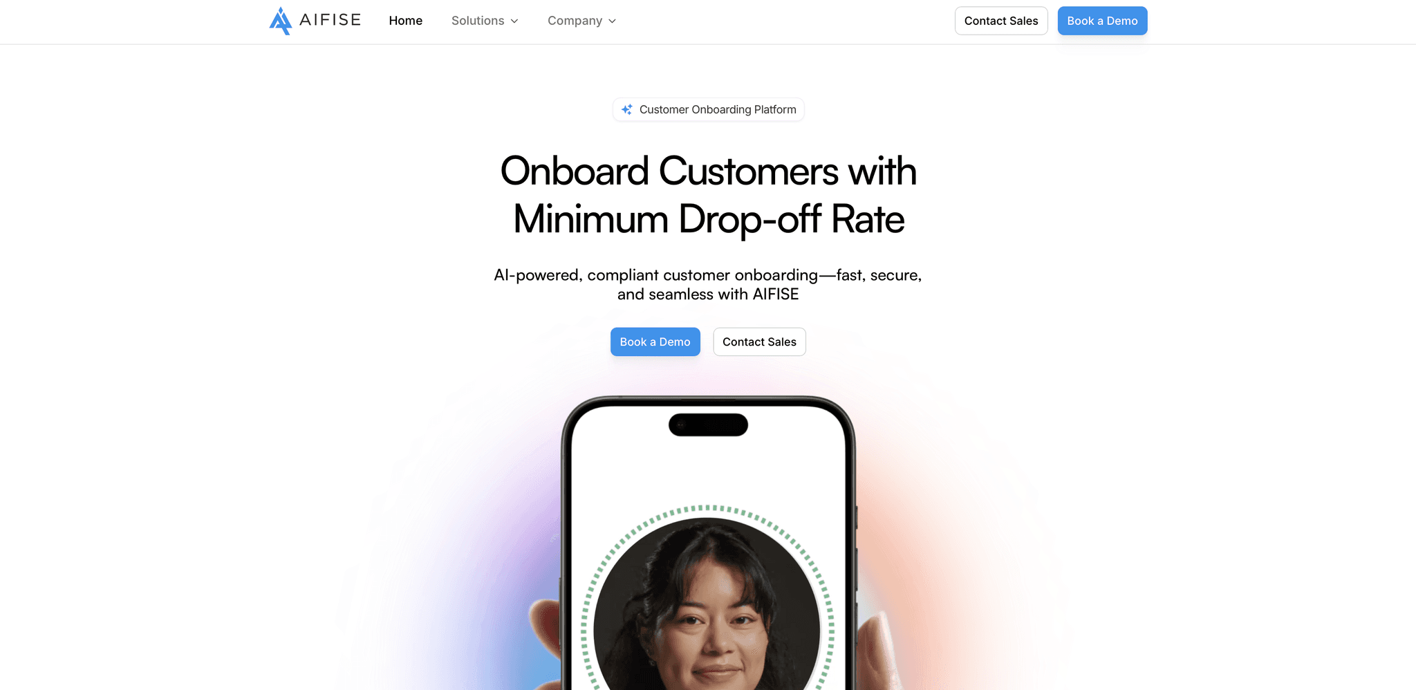
Repositioned CTA above the fold, with contrasting color and supportive microcopy to drive urgency and clarity.
Designed a streamlined layout with a clear path to action using visual hierarchy, whitespace, and scannable sections.
Created a more trust-building interface with testimonials, product benefits, and recognizable partner logos before the CTA.
Reduced form friction by breaking two step form into one simple step.
Added subtle animations and interaction cues to guide user focus.
Aligned the interface with UX psychology principles like Hick’s Law (reducing decision fatigue), Fitts’ Law(clickable targets), and Zeigarnik Effect (encouraging completion once started).
Results & Impact
Demo Request Conversions:
Increased from 1–2 in 3–4 months → 6–7 per month
→ That’s a 900%+ increase in conversion rate.
SEO & Organic Growth:
Google rankings jumped from 10 to 78
Organic search views rose from 2–3 → 40–50 in 60 days
→ A 1,500%+ increase in discoverability.
Engagement Metrics:
Bounce rate dropped significantly on key pages.
Time-on-page improved by over 30%.
Heatmaps showed increased interaction with CTAs and demo sections.
Learnings & Takeaways
Even small UX shifts can create massive business impact when grounded in user data.
Aligning design psychology with analytics leads to more informed, high-converting experiences.
Cross-functional leadership was key to execution speed and quality.
Explore My Work & Marketing Impact
💬 As part of the overall strategy, I also crafted and executed a targeted LinkedIn content plan to support the website revamp. This led to a noticeable uptick in engagement, reach, and demo interest through organic posts—reinforcing the impact of a cohesive product-marketing approach.
Explore the live website:
🌐 aifise.ai
Connect with me on LinkedIn:
🔗 linkedin.com/company/aifise/about/