
Design + Content + Strategy = Real Results
When we talk about product design, the conversation often leans heavily on visuals. But in reality, great product design is a harmony of UX, content, and strategic thinking—all aligned toward a clear business goal.
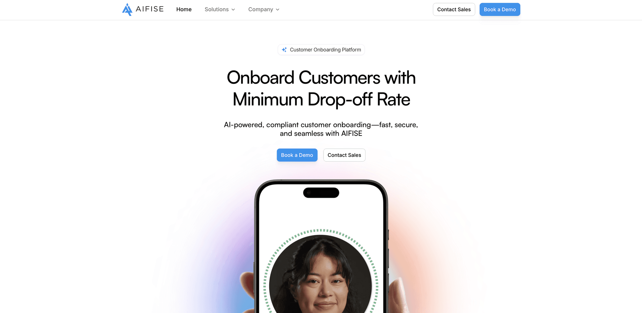
This is exactly what we achieved at AIFISE.
The Challenge
AIFISE, a B2B SaaS company, had a solid product—but the website wasn’t converting. In 3–4 months, the site generated just 1–2 demo requests. Visibility was low, and user engagement was almost nonexistent.
They needed more than a facelift. They needed a design-led growth strategy.
The Goal
Redesign the website and user journey to:
Increase demo requests
Improve user engagement
Strengthen brand perception
Boost SEO and organic visibility
The Process
1. Funnel & Behavior Analysis
I started by diving into Google Analytics and Hotjar to answer one question:
Where are users dropping off—and why?
Heatmaps showed confusion around CTA placement
Session recordings revealed friction in navigation
Analytics exposed high bounce rates and low time-on-page
2. Hypothesis Building
Based on insights, I formed this hypothesis:
If we simplify navigation, clarify CTAs, and guide users with purposeful content, we’ll reduce friction and boost conversions.
Heatmaps showed confusion around CTA placement
Session recordings revealed friction in navigation
Analytics exposed high bounce rates and low time-on-page
3. A/B Testing & UX Experiments
We experimented with:
Button placements and CTA messaging
Hero section clarity
Visual hierarchy and layout changes
The goal? Find the version that reduces cognitive load and improves conversion paths.
4. Content Writing & Messaging
Here’s where I leaned into content strategy:
Rewrote copy to guide users intuitively
Aligned messaging with user pain points
Made CTAs actionable and value-driven
Yes, I was the mind behind the content too—ensuring words did as much work as visuals.
5. Design Execution & Visual Identity
Working alongside Vicky Sharma, who led the visual design, we brought the strategy to life:
Clean, modern UI
Trust-building visuals
Consistent branding
6. Implementation & Team Collaboration
I led a cross-functional team of designers and frontend developers, ensuring:
Fast rollout
Pixel-perfect handoff
Alignment between strategy and implementation
The Impact
The results were not just visible—they were measurable:
✅ 900% increase in demo requests (1–2 in 3–4 months → 6–7 per month)
✅ SEO ranking jumped from 10 → 78 (as of last check)
✅ Organic search traffic grew from 2–3 views to 40–50 in 60 days
✅ Improved user engagement and lower bounce rates
✅ Stronger LinkedIn engagement via coordinated content strategy
Final Thoughts
This wasn’t just a visual upgrade—it was design + content + strategy working in sync, focused entirely on driving business growth.
🔗 Explore the live site: aifise.ai
🖌️ All visual credit goes to Vicky Sharma
✍️ Content and strategy by me.
If you're looking to work with a product designer who solves real problems with measurable outcomes—I'm open to chat.
👉 Dive Deeper into the Full Case Study
Curious about the full behind-the-scenes process, detailed UX flows, and before/after design comparisons?
👉 Check out the full case study here